Friday 11th January, 2019
Semantics of style

Friday 4th January, 2019
Miscellaneous

A few weeks ago, in "Citizen of Nowhere on a Brexit Farewell Tour", I quoted Theresa May's
If you believe you are a citizen of the world, you are a citizen of nowhere. You don't understand what citizenship means.
This is a dreadful insult, from somebody who appreciates neither the opportunities offered by free movement within the EU, nor the attitude of people who wish to seize them. So to set her words, I wanted a font that would convey my opinion thereof. I also wanted it to stand out from the surrounding text, while still fitting in with the stark black and white design of the WordPress theme — presentation software — I'm using. So I Googled "typeface indicating anger". I was pleasantly surprised when Google came up with a relevant link in its second search result, to HubSpot's "Fonts & Feelings: Does Typography Connote Emotions?"†.
That post summarises research published in 2006 by A. Dawn Shaikh, Barbara S. Chaparro & Doug Fox at the Software Usability Research Laboratory, Wichita State University. Beware, because there's a link in "Fonts & Feelings" to the lab's website, whose domain has been taken over by a domain scammer. Luckily though, Shaikh et. al.'s paper is available via CiteSeerx, at "Perception of Fonts: Perceived Personality Traits and Uses"‡.
The authors introduce their research by noting that researchers have paid more attention to font readability than to personality:
Often credited with creating first impressions, fonts are typically classified according to unique typographical features (serif, sans serif, etc) and overall appearance. The combination of appearance and typographical features often lead graphic artists and typographers to describe typefaces using personality traits ("less cuddly, more assertive," Berry, 2004)§. In a BBC audio program (Peacock, 2005)‖, fonts were depicted as feminine and masculine, among other traits. Feminine fonts were described as fine, serifed, sleek, and elegant; masculine fonts were characterized as being blocky and bold.
Most empirical research concerning fonts focuses on the legibility or readability with little concern for the perceived personality of typefaces. Typographers and designers are often interested in the typeface personality or "typographic allusion" which refers to "the capacity of a typestyle to connote meaning over and above the primary meaning which is linguistically conveyed by words" (Lewis & Walker, 1989, p. 243)¶.
Brumberger (2003)◊ describes the Bauhaus school of design and their belief that the "content and purpose of the text should dictate the design — the form — of a document, and that form, including typography, should express the content just as the verbal text itself expresses content" (p. 207). Within communications research, many experts suggest that typefaces can convey mood, attitude, and tone while having a distinct persona based on the font’s unique features. Each document should be rendered in a font that connects the mood, purpose, intended audience, and context of the document.
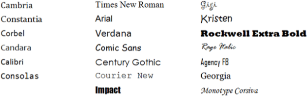
The authors aimed to provide empirical evidence to make up for this lack. They actually carried out research on both the personality of fonts, and their uses, but I'm going to describe only the former. They began by choosing 20 fonts to investigate:
This is what these look like:
As well as deciding on fonts to rate, the authors worked out 15 pairs of contrasting personality adjectives, such as sad/happy, conformist/rebel, polite/rude, and cuddly/coarse. They say that they determined these through personality research, adjective lists, and pilot testing. Here's the complete list:
| Stable | 🔘 | 🔘 | 🔘 | 🔘 | Unstable |
| Polite | 🔘 | 🔘 | 🔘 | 🔘 | Rude |
| Formal | 🔘 | 🔘 | 🔘 | 🔘 | Casual |
| Flexible | 🔘 | 🔘 | 🔘 | 🔘 | Rigid |
| Exciting | 🔘 | 🔘 | 🔘 | 🔘 | Dull |
| Assertive | 🔘 | 🔘 | 🔘 | 🔘 | Passive |
| Conformist | 🔘 | 🔘 | 🔘 | 🔘 | Rebel |
| Attractive | 🔘 | 🔘 | 🔘 | 🔘 | Unattractive |
| Cuddly | 🔘 | 🔘 | 🔘 | 🔘 | Coarse |
| Creative | 🔘 | 🔘 | 🔘 | 🔘 | Unimaginative |
| Elegant | 🔘 | 🔘 | 🔘 | 🔘 | Plain |
| Masculine | 🔘 | 🔘 | 🔘 | 🔘 | Feminine |
| Sad | 🔘 | 🔘 | 🔘 | 🔘 | Happy |
| Youthful | 🔘 | 🔘 | 🔘 | 🔘 | Mature |
| Practical | 🔘 | 🔘 | 🔘 | 🔘 | Impractical |
With these starting materials in hand, the next stage was an online survey. Each subject was shown a sample of text in each of the 20 fonts, and asked to rate it on the scales above. Text was displayed online, because the authors were interested in on-screen fonts rather than printed. 561 subjects answered.
The outcome (I presume) was that the authors ended up with 561 ratings for each font. Each rating would have been a collection of 15 numbers between 1 and 4, thereby classifying it along 15 personality dimensions.
This is a lot of data, so the next step was to simplify it by so-called "dimensionality reduction". To see how this works, imagine that instead of 15 pairs of adjectives, there had been just 3: sad/happy, conformist/rebel, and cuddly/coarse. Suppose also that subjects always answered conformist/rebel and cuddly/coarse in the same way, so that both always got the same numeric values. We can see that as both values are always the same, one is redundant: it doesn't tell us anything the other doesn't.
Here's a possibly helpful way to visualise this. Imagine each rating as a point in three-dimensional space with an X distance along a sad/happy axis, a Y distance along a conformist/rebel axis, and a Z distance along a cuddly/coarse axis. But the Y and Z distances are always equal, so we can drop one of them, thereby reducing the number of dimensions from 3 to 2.
In practice, data is never neat, and different dimensions are never perfectly correlated. Nevertheless, it is still possible to dig out some correlations. Using a technique called principal-component analysis, the authors did so, and reduced the number of dimensions from 15 to 5. In effect, the ratings, taken over all subjects, ended up classifying the fonts into five groups or clusters, which corresponded to the original division into serif, sans serif, scripted/fun, monospaced, and display or modern. Interestingly, subjects were fairly consistent about how they assigned personality traits to these, as shown in the list below:
We can invert this. Instead of looking at the personality traits
associated with a font, what were the fonts associated with each
personality trait? The authors show this in their Table 3, which
lists the fonts rated the highest for each personality trait
evaluated in the survey:

So now you know why I chose Impact. As the table shows, it was rated assertive, rigid, rude, sad, unattractive, and coarse. (And masculine, but let's ignore that.) Just like Theresa May's Citizen of Nowhere insult.
†"Fonts & Feelings: Does
Typography Connote Emotions?" by Sophia Bernazzani, in the
HubSpot blog, 2 Jan 2017, updated 18 April 2018.
Wayback
https://blog.hubspot.com/marketing/typography-emotions
‡
"Perception of Fonts: Perceived Personality Traits and Uses" by A. Dawn
Shaikh, Barbara S. Chaparro & Doug Fox, in Usability
News, Software Usability Research
Laboratory, Wichita State University, February 2006.
Wayback
http://citeseerx.ist.psu.edu/viewdoc/download?doi=10.1.1.551.228&rep;=rep1&type;=pdf
§ Berry, J.D. (2004). Now read this: The Microsoft ClearType font collection. Seattle, WA: Microsoft Corporation.
‖ Peacock, I. (Speaker). (2005). From Arial to Wide Latin (Radio Broadcast). London: BBC Radio. (Available online: http://www.bbc.co.uk/radio4/science/fromarialtowidelatin.shtml )
¶ Lewis, C., & Walker, P. (1989). Typographic influences on reading. British Journal of Psychology, 80, 241-257.
◊ Brumberger, E. (2003). The Rhetoric of Typography: The Persona of Typeface and Text. Technical Communication, 50(2), 206-223.