Monday 19th November, 2018
Colour analysis, Colour-scheme generators, Machine learning

Friday 16th November, 2018
Attitudes, Colour analysis

While I was looking for photos of green-and-purple clothing, I came across a colour-scheme generator named Colormind. There are lots of generators on the web. What distinguishes Colormind is that it tries to make its schemes acceptable to humans.
This is difficult, says Colormind's author, Jack Qiao. In his blog post "Extracting Colors from Photos and Video", he writes that:
Human-designed color palettes typically have some high-level structure — a gradient running left to right, similar hues grouped together etc., and have some minimum amount of contrast between each color. Automatically created palettes [ones automatically created from an image] look more haphazard, with colors distributed according to how they were used in the original image.
There's a short discussion about this on the YCombinator Hacker News group at https://news.ycombinator.com/item?id=16351409. There, Jack proposes an experiment to demonstrate the difference between randomly generated palettes and ones designed by experts. Go to https://color.adobe.com and click on one of the color rules. Adobe will generate a random palette based on that rule. Then compare it with a palette uploaded by users on https://coolors.co/ or https://color.adobe.com/explore/ .
Given that there is this difference, how can one make a machine generate
human-style palettes? Jack's answer is to use the results of machine
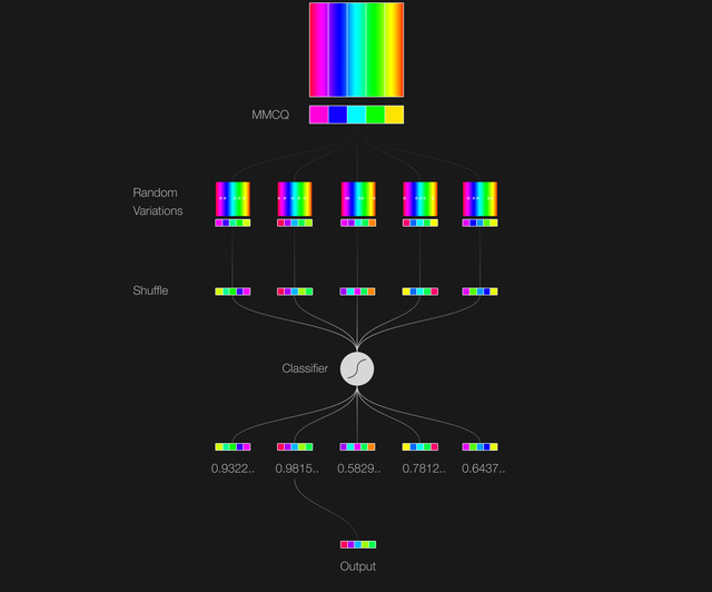
learning. Here's his diagram for the process:
 [ Image: from "Extracting
Colors from Photos and Video" by Jack Qiao in his blog. ]
[ Image: from "Extracting
Colors from Photos and Video" by Jack Qiao in his blog. ]
The first stage is colour quantisation. And now you know why I devoted a post to this last Friday. In the diagram above, that's represented by the first sub-image, the one labelled MMCQ. That's an abbreviation for the name of a particular colour-quantisation algorithm, the so-called Modified Median Color Quantization. The second stage is to produce a few random variations on the extracted palette, shown in the row below. The third stage is labelled 'Shuffle'. From Jack's diagram, this appears to mean that it shuffles the order of colours within each palette. The fourth stage feeds all the shuffled palettes to a "classifier", which rates them for acceptability. And the fifth stage rejects unacceptable palettes.
Where machine learning enters is the classifier. Jack trained this on palettes that he'd chosen as "good looking". As he says, "In the end [after some experiments] I built a self-contained classifier and trained it on a hand-picked list of examples. Good color palettes generally have good color contrast and an overarching theme, and bad ones look random and/or has bad inter-color contrast." Once trained, Jack's classifier acts as a gatekeeper, letting through only palettes that it thinks are good looking.
So to summarise, Colormind reduces a photo to a palette consisting a small
number of colours. It then generates random variations on this, and then
rejects those that, to a gatekeeper trained on appealing palettes designed
by humans, look bad. I was curious to see how this would apply to my red
silk top, which as I mentioned in
"Visualising
Clothing Colours as a 3D Cloud of Points II", is an intense red with
little white. Here are three palettes Colormind generated from it:
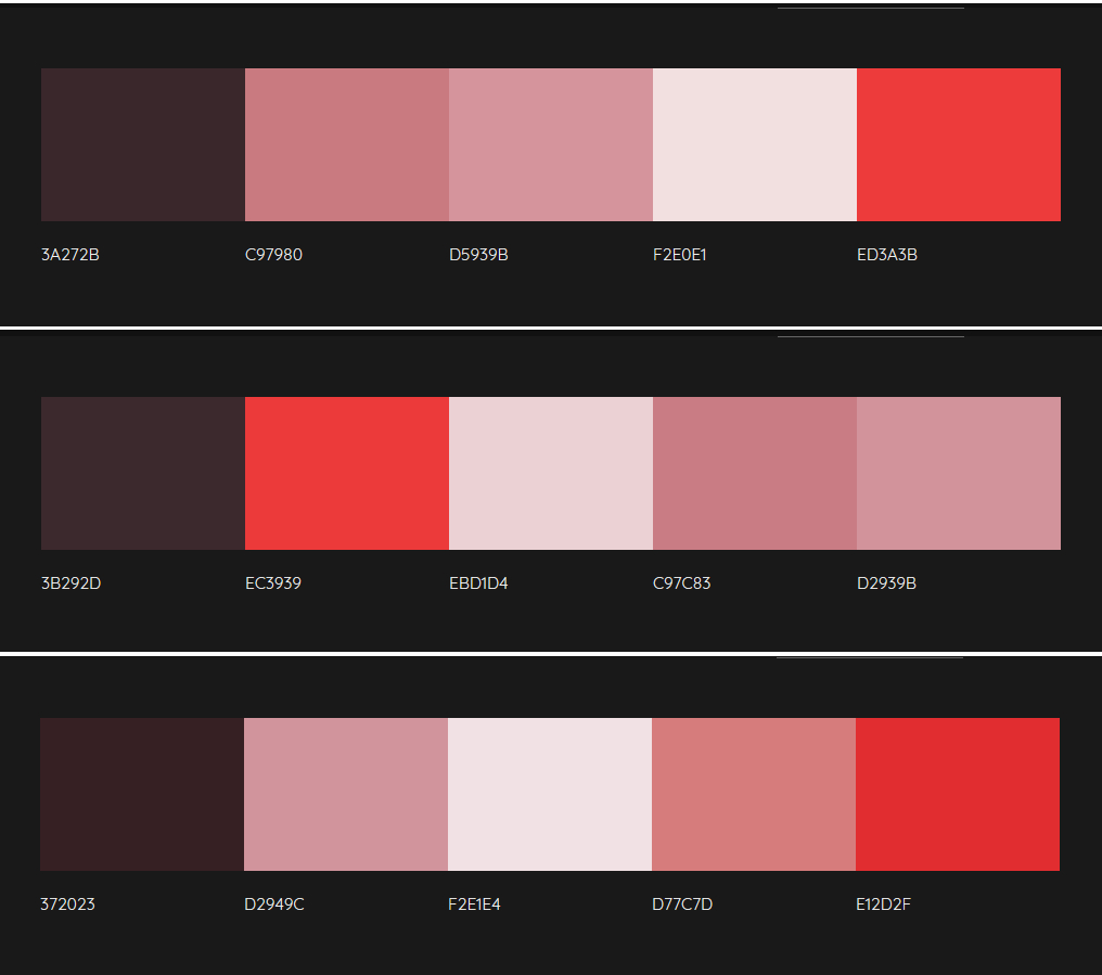
Each has an intense red, two pale brick-reddish-pinks, a very pale whitish
red, and a dark maroony-aubergine.
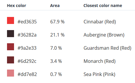
For comparison, here's the TinEye palette. It has a very different
distribution. which hasn't balanced the darks with a pale:
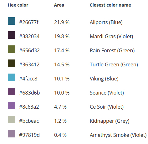
Here's one other example, from the photo of the blue, green, and plum
shirts together. The first image is from Colormind, and the second from
TinEye. I don't know why Colormind hasn't given me the colour labels this
time.

To see how Colormind does on other images, try it yourself. Should you want to use my photos, I've made them available in this zip file.