Friday 16th November, 2018
Attitudes, Colour analysis

Colour analysis

In my previous two posts, I showed off the colour distributions for some of my clothes. These vary widely from one garment to the next. But they all consist of innumerable points, each representing a slightly different colour from those nearby. Sometimes, we need to reduce this multiplicity to a much smaller number. That's called colour quantisation, and is what I'm going to introduce today.
Wikipedia explains colour
quantisation as "a process that reduces the number of distinct colors
used in an image, usually with the intention that the new image should be
as visually similar as possible to the original image". I referred to
Wikipedia because I wanted to use two of its public-domain images. The
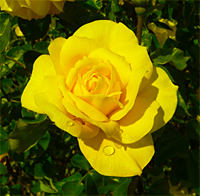
first is this rose:
 [ Image: from Wikipedia article on "Color
Quantization". Credited to Dcoetzee. ]
[ Image: from Wikipedia article on "Color
Quantization". Credited to Dcoetzee. ]
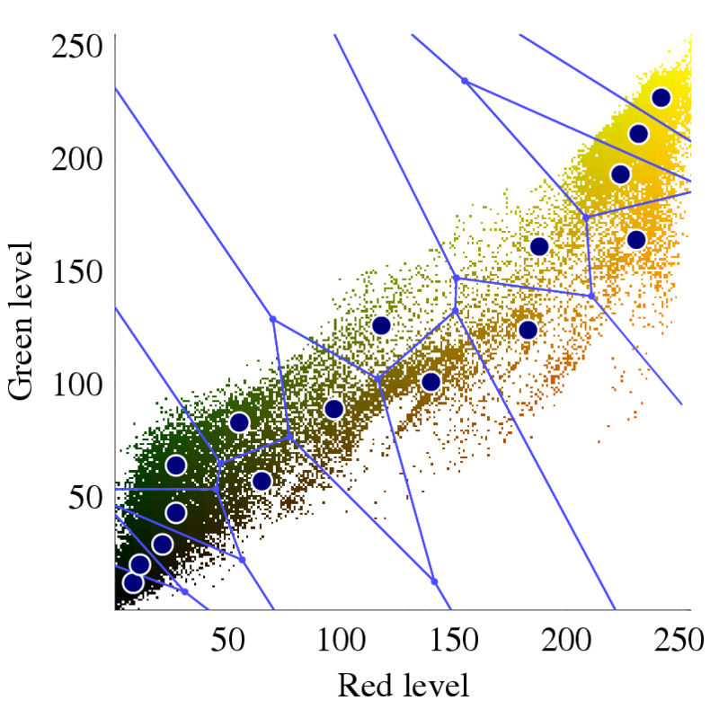
The second picture
I wanted is below, and is the colour distribution for the rose. It was
produced by
different software from the distributions in my last post, so doesn't look
exactly
the same, but the idea is the same. The only difference is that because
the
blue has been removed, there are only two colour axes. I.e., the
distribution lies in
a plane:
 [ Image: from Wikipedia article on "Color
Quantization". Credited to Dcoetzee. ]
[ Image: from Wikipedia article on "Color
Quantization". Credited to Dcoetzee. ]
I mention lying in a plane only because it makes the next bit easier to understand. As well as the distribution itself, the image contains lines dividing it into 16 regions, and blue dots marking the centre of the regions. These describe, Wikipedia says, "an optimized palette generated by Photoshop via standard methods". What this means is that Photoshop has squished the multiplicity of colours down to 16. It thinks that these are "optimized", in that if you were to replace each region's colours by the region's centre, this would do less damage to the image than if you used any other set of 16 regions.
What would such a colour-reduced image look like? I don't have one for the
rose, but I've made a different example. At the top of this post, you'll
see my logo: a pattern of fruit and flowers taken from a rather lovely
velvet waistcoat by Oakland. I fed this to the online TinEye Color extraction page.
Doing so is easy: just browse and upload an image, or submit its URL.
Here's the result for my logo. The reduced set of colours is on the right,
and the reduced image made from them is the top one on the left.
![]()
That's almost all I want to say about colour quantisation, now that I've introduced the concept. There are a variety of algorithms for achieving it, and these have been built into lots of different software packages. Wikipedia sounds a caution about these:
The name "color quantization" is primarily used in computer graphics research literature; in applications, terms such as optimized palette generation, optimal palette generation, or decreasing color depth are used. Some of these are misleading, as the palettes generated by standard algorithms are not necessarily the best possible.
In other words, distrust the words "optimal", "optimised", and "optimum".
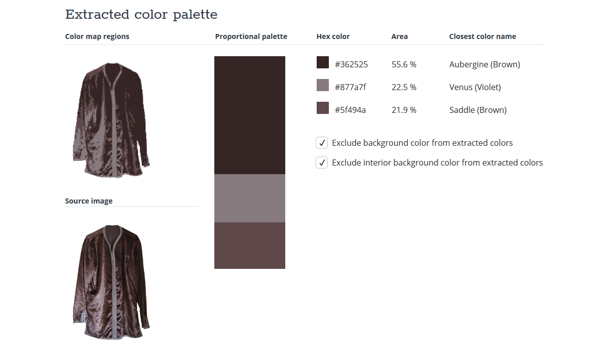
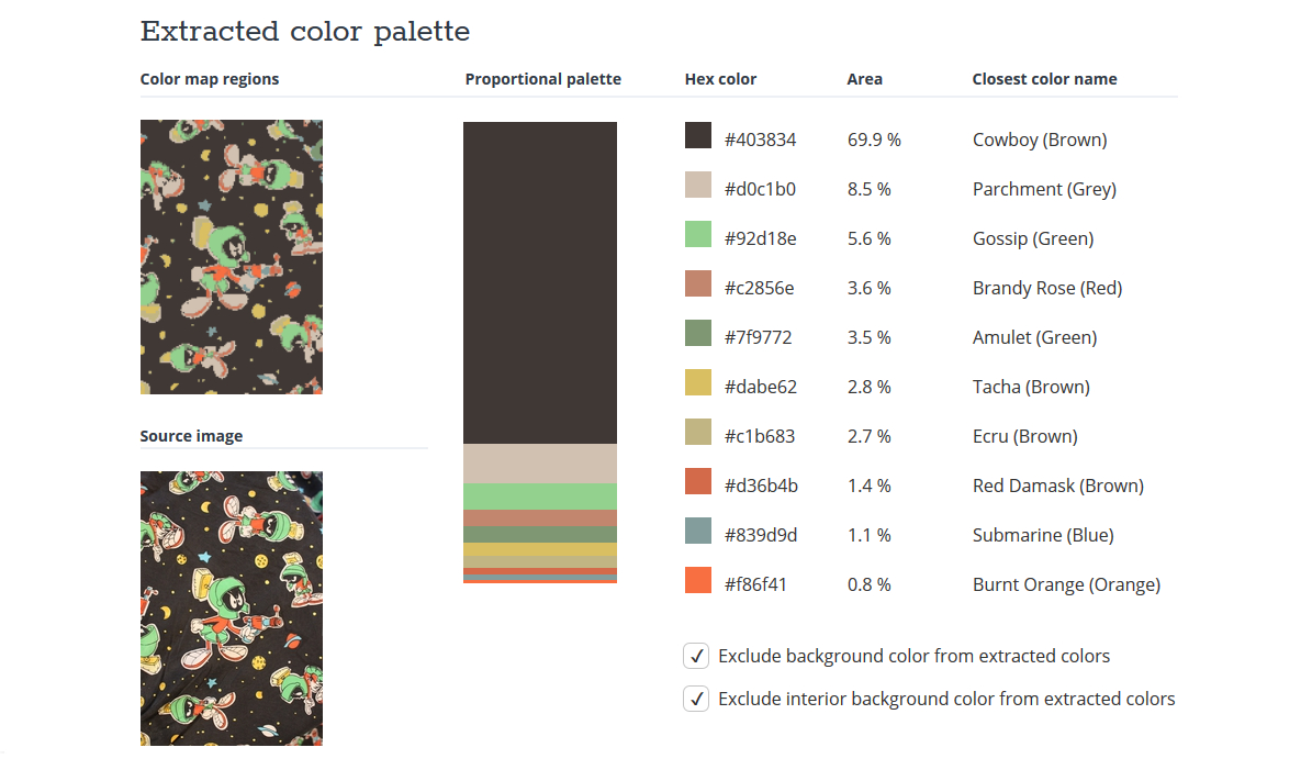
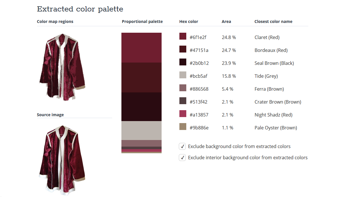
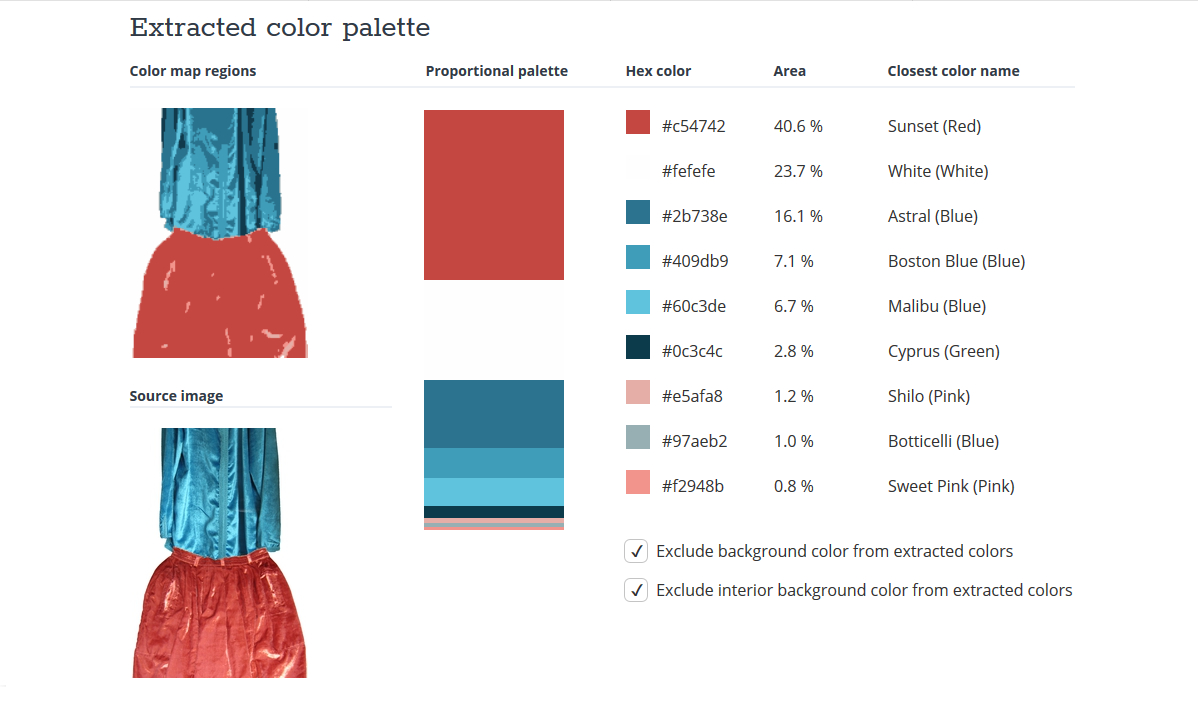
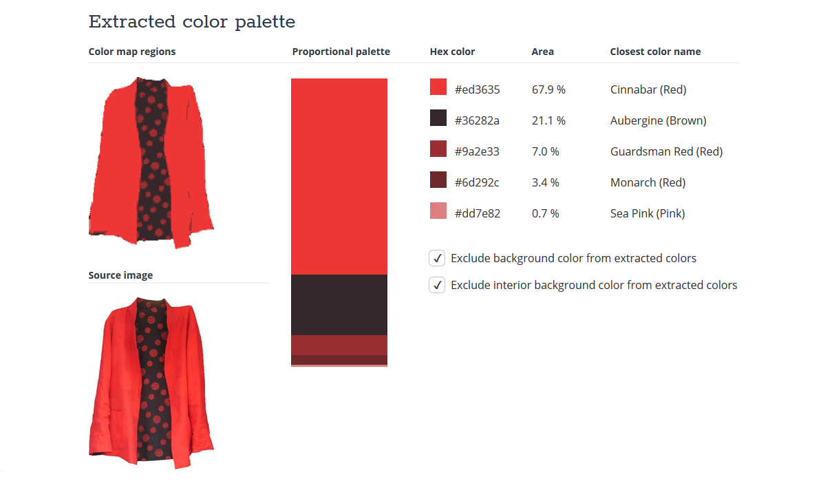
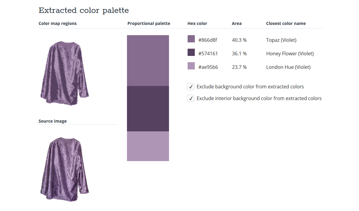
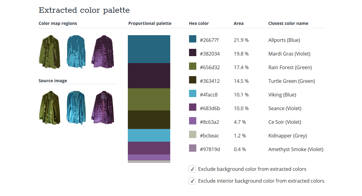
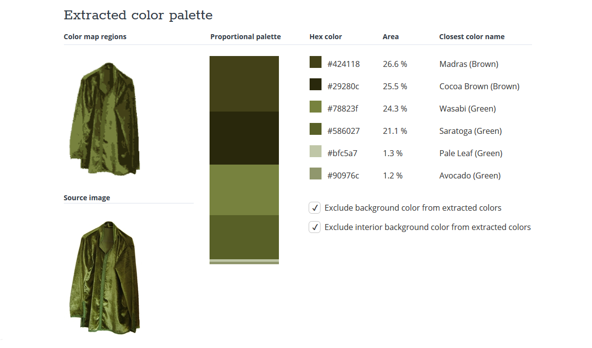
Before finishing, here are some more examples, using the clothing photos I
analysed for colour
distribution in the previous two posts. These are also from TinEye.