Colour analysis

Monday 5th November, 2018
Colour combinations, Illustrations

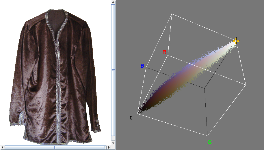
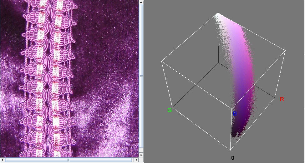
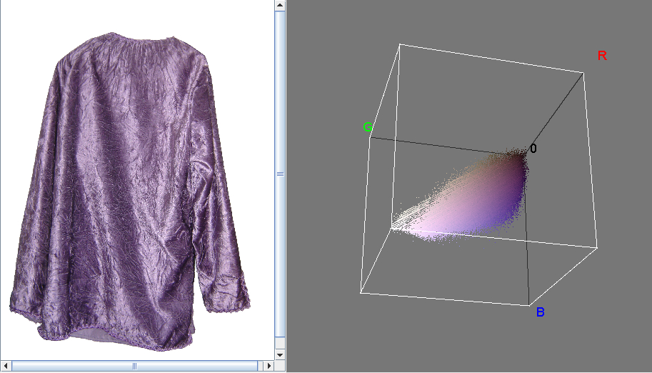
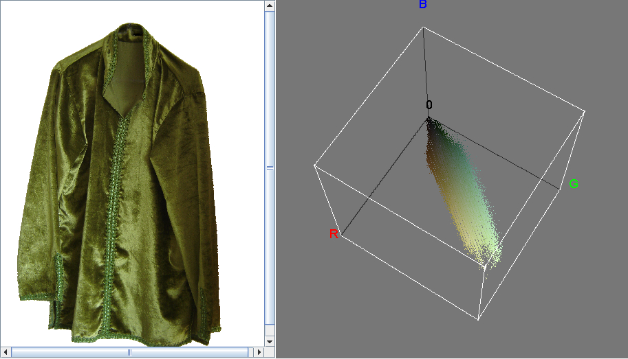
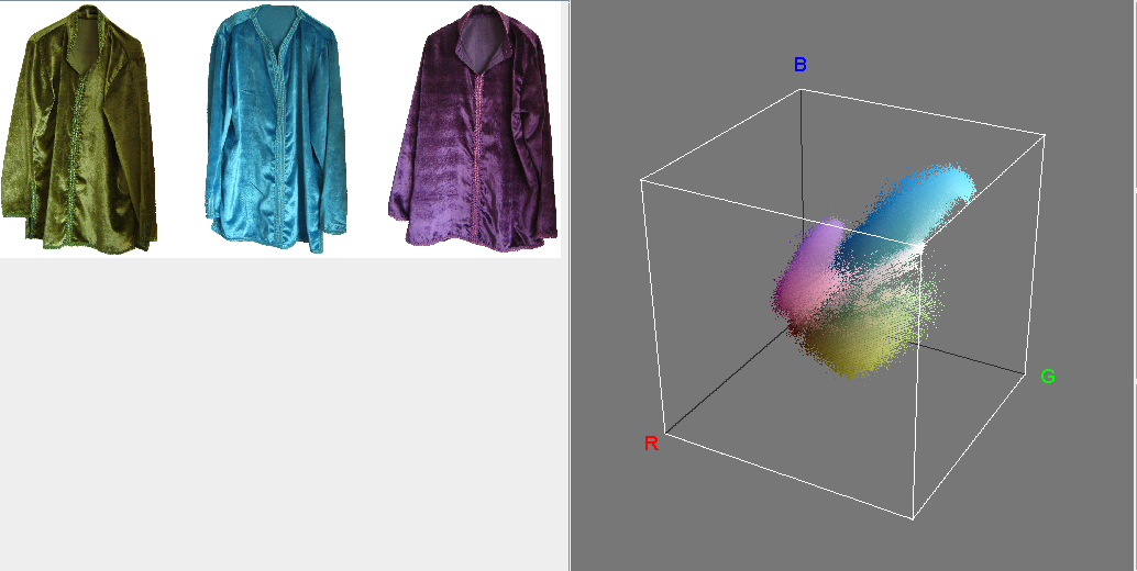
Friday's post was about displaying the colour distribution in clothing photos. Here are the results of trying it on some more of my clothes. The first few are velvet Moroccan shirts in chocolate-brown, garnet-red, violet, ice-blue, rose-pink, and sage-green. Then there's a cube for the green, blue and violet shirts together. Then one for my red silk Chinese top. And finally, one for this silk shirt by Colorpoint, decorated with figures of the Roman-inspired Marvin the Martian.
The preponderance of Moroccan is because I need the background removed, so
that its colour distribution doesn't get mixed in with that of the
clothes. As it happened, I'd already done so for most of the Moroccan
ones, when I was preparing for a show.
But background removal is tedious and imprecise, and I've not done it for
most of the other clothes.
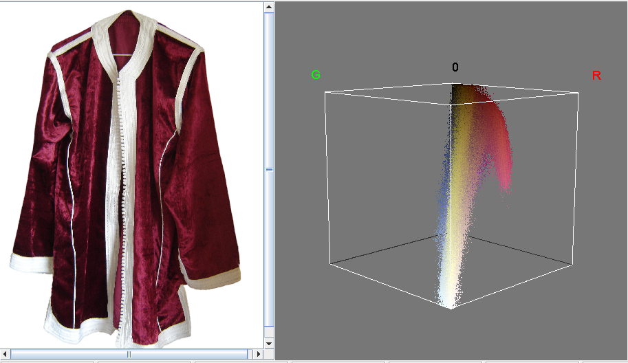
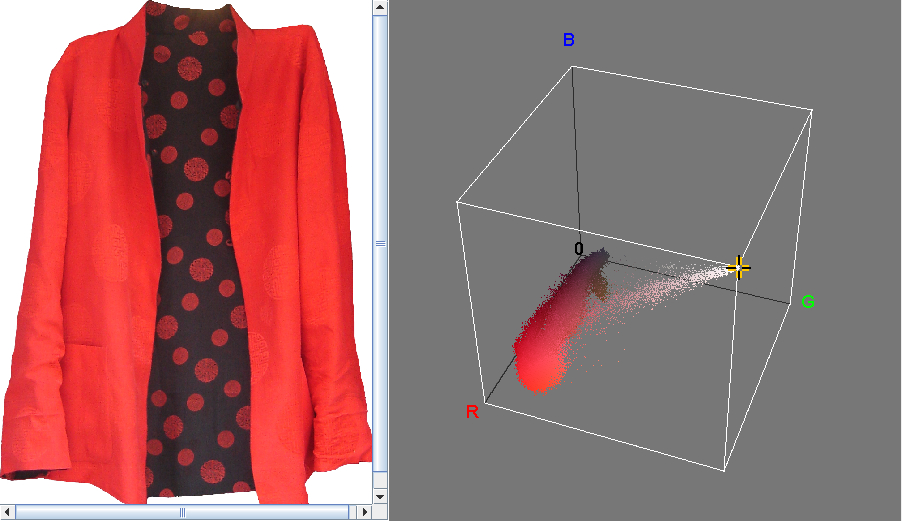
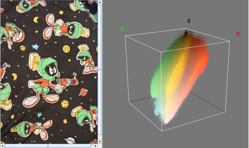
I love the vividness and contrast in the distribution for the Colorpoint shirt. But the most noticeable thing is the intensity of the colour plume for the red silk Chinese top. Unlike with the other clothes, the plume goes off to a colour corner (red), with only a very thin offshoot to the white corner. This may be because most of the other clothes have either patches of whitish shine, or actual whitish material as in the garnet-red shirt. But also, the silk top does look an intense red when I wear it — a red that I 've not seen on any other garment. I've been told that silk dyes more intensely than other fabrics, though I can't find anything online that confirms this.